Showing posts with label Research. Show all posts

Monday, 14 April 2014

Artsnacks

Logo taken from blog.artsnacks.co.

Interesting little website and blog I stumbled across via good ol' social media. ArtSnacks is a monthly subscription service that you can sign up for online, that provides artists and really anyone with a creative interest, with tastes of top-line art products. The creators also run a 'user-submitted art site' called Eat Sleep Draw, you might have heard of it... it's one of the largest sites of it's kind aiming to inspire creativity and pushing 'quality over quantity.' So, they must know what they're on about.

Sample photograph of one of their tasty boxes, taken from artsnacks.co

Anyway, for $20 a month, approximately £12, 4/5 surprise items of full-size premium art supplies will arrive at your door including a menu card with descriptions, tips and usability information, sometimes even a few sweeties are thrown in. It's a fantastic way to try equipment you wouldn't normally use or little testers of something you wouldn't want to pay for in bulk. Other than that the site is wonderfully simple to use and beautifully designed. They even have a blog where people can share their thoughts on the latest
boxes and show off the images they've created.

Saturday, 5 April 2014

Furiously Mad: 300 Years of Legal Insanity.

"A fascinating insight into mental health, past and present."  - PHM.org.uk

Exhibition flyer taken from 'artsforhealthmmu.blogspot.uk'.
'Furiously Mad' an exhibition funded by the Heritage Lottery, has allowed Pool Arts, a group of artists from diverse backgrounds, to research and respond to the framework of law that surround mental health. Each member contributed their personal response to reveal an interactive timeline, ranging from historical legislative information to modern day care and treatment of the mentally ill.

I visited the People's History Museum for the first time today especially to catch a performance in relation to this exhibition and I was knocked for six at the overwhelming creativity and spirit bursting out of the hall. The work presented was incredibly diverse, everything  from drawings, printed posters, installation work, paintings, animation, performance and activities. Circling the room gave you invaluable insight into just how expansive the term 'mental health' is and how terrifying it can be living with conditions such as schizophrenia. But for me, it was the positives that were illustrated best. Of course a few of the installments were intended to shock, but in order to let the viewer to formulate a complete 'mental image' if you will, of previous and (sadly) current discrimination of people with mental health problems. It all stems from misunderstanding, even the people who suffer from such issues must learn to accept and overcome the fear of terminology, side-effects and hospital visits just like everyone else must eradicate barriers between themselves and fear of those with mental health issues.

I met Galen, a young man working a badge machine to let children, well actually mostly adults, personalise their own brightly coloured badges. Galen was admitted to the Priory Hospital in Darlington with various long term problems, he spent his time during hospitalisation drawing and encouraging other patients to express themselves artistically. This culminated in him initiating a art competition with treats and chocolate as rewards for everyone who part-took, he continued the same style of competition during the exhibition hours allowing everyone attending to decipher a colour-scheme and render and copy of his drawing. His work in particular held a statement; to help others even when you struggle to help yourself.

A lot of the artists were available to talk about their pieces, their experience and their reflection encompassing the topic. They were so open, even when it came to receiving feedback it seemed the comments left upon leaving were welcomed over donations for the fund. I have never met a more inspirational group of people, the show was an absolute success and I would urge everyone to visit.

Friday, 13 December 2013

Portfolio Visit Numero Tres.

I had my final portfolio visit of the year this afternoon with Alan Dalby at his cute studio in Hotspur House, near Oxford Road Station.

Sourced from Hotspur House facebook
Alan's room is right next to LaserLea, who I visited earlier in the year, and in such a unique building right in the heart of Manchester. I was excited just to be back there and to visit his studio which was super cosy and very inviting.

Homepage from alandalbyillustration.com

Alan is my 'guru' who I was paired up with by the tutors and I'm actually very thankful for their choice. Although his work is very different to mine and he uses mainly digital methods of working, we have similar interests and work pace. He's established his work, website and social media as a brand that all resonate on a professional and accessible level, something I've been very interested to pick up on. We had a lot to talk about as we've met a few times previous to the guru meeting and I felt comfortable telling him the problems I was having within my technique and issues with my portfolio.

After taking on board the feedback I'd received from my previous two portfolio visits, I'd refined my portfolio, taken the logo out of the equation, created an introductory page and created business cards, so I had a lot of finalised material to show Alan. I was still surprised at how positive he was though, he said he could barely flaw my layout and that I'd found a balance between my work and the surrounding space. The only criticism he had was to ensure that all the text was in line and flowed between every page, and to remove the dates I had affixed to each piece. He was impressed with my business cards and asked to keep one of each, which I of course allowed, the least I could do. He particularly liked the work I'd completed at the end of second year for Noise, Piece for Protest, of which I had included the series of three animals holding weapons. I asked him for any advice with improving the presentation of my drawn pieces and made it clear that I would be happy to spend time removing the backgrounds and completely re-facing them if that would help. In regards to the line drawings he said that was my best bet, to enhance the original drawings and stop gluing them onto scrappy bits of card (a horrible habit I created in second year for some bizarre reason.)

Alan's Tumblr Blog linked to his site.

Monday, 9 December 2013

Portfolio Visit Numero Dos.

This evening me and Dan Gatens met with Ben Jones, graduate from Stockport College, successful Illustrator and currently, multi-tasking teacher. I knew he had a busy schedule, especially before christmas, so I was extremely grateful that he agreed to spend an hour with us.

Sourced from benjonesillustration.com

After seeing Chris from the Media Octopus a week or so before, I'd updated my portfolio by removing a few pages and replacing them with images that flowed much more smoothly and placing each page in In-Design. The first thing Ben had to say was to minimise all of the descriptive text, leaving it just as a title and one line of context, and to remove the logo I had created to spot on each page. Using the space around the images would allow my work to breathe, speak for itself and attract the viewer with the quality of drawing instead.

After reviewing the rest of my portfolio he agreed with me that some of the pieces created with mixed media didn't fit in with the fine drawing and watercolour paintings and that towards the end of the year it'd be a nice idea to refine it further and invest in a quality portfolio, with removable pages.
I really value Ben's advice and was pleased with everything he had to say about my work whether it was critical or not. Unlike my meeting with Chris, the time spent with Ben was more focused around the layout and style of my actual portfolio and some tips toward an editorial I was working on. His advice for me personally was to keep up good habits, listen to my heart more rather than my head and get stuck in as soon as I finish uni. Apply for competitions (worthwhile ones), give every opportunity your all and never complain about being busy.

He's offered to look at my PDF portfolio early on next year and guide me with anything I need help with, which I couldn't be more thankful for.

Sourced from benjonesillustration.com

Wednesday, 27 November 2013

Clients From Hell.


This post is literally about, Clients From Hell. I stumbled across this website whilst seeking some advice on editorials and the development process in any work dictated from a clientel basis.

Poster courtesy of Ireland's creative community; http://sharpsuits.net/.

A Creative Catharsis; http://sharpsuits.net/
It would seem that the battle between designer and client is as of yet, never ending. I've learnt some very important lessons, the easy way really, through speaking to professionals with hands on experience and research via resourceful blogs. Broken down into a couple of main points, here's what i've gathered regarding what to avoid and what to go for;

  1. Freelance doesn't mean free...people happy to be paid in exposure or peanuts will most likely make a mockery of you, base designs on your, the client, personal taste and completely ignore the intended target market. Invest in a caring, professional graphic designer and you're much more likely to get careful research, resourceful ideas and bundles of energy to go with it. Someone run ragged with no incentive will not want to play ball and smile about it.
  2. C'mon, be realistic...in relation to time scale, quality, quantity and relevance you really do get what you pay for with design. Realistically you can't have everything and even if you find an Illustrator with superpowers who doesn't need to leave their desk for a week one of two things is bound to happen. It's either going to be produced in record timing and be complete codswallop OR in compliance with ticking all said boxes, cost an absolute fortune.
  3. Utilise your designer...in short, client and designer alike should never, even accidentally, take the other party as stupid (unless you've got hard evidence). Clients often fall into the trap of telling their designer exactly what to do instead of exactly what they want, forgetting that they're paying a person to make something wonderful of their idea, not a monkey to sling it on photoshop. Patronising someone who probably has much more knowledge and experience in a field you're asking for help in, isn't smart. You'll end up burning money and getting tied up in circles...although on the other, our lovely manner designer will of course understand that said client won't always know exactly what he wants in the first place, and be happy to work through the kinks.
The line is fine but not one to be overstepped often or misunderstood.

Sunday, 24 November 2013

Website Research and Review.


Having just purchased my very own domain I realised I hadn't the foggiest what I wanted my website to look like. So...website envy commences! This was probably one of the easiest areas of PDP for me as ninety nine percent of my bookmarked pages online are artists websites or design pages. Websites are very easy to judge by sight and of course how easily you can navigate round them, but now I needed to look at them through a designers eyes, review elements I would carry onto my own site.

First port of call was to take a peek at some of my favourite illustrators and creative makers websites to see how they saw fit to execute them, I'll start with a front-runner; Dennis McNett, creator of Wolfbat and holder of wolfbat.com.

Wooden Carving by Dennis McNett of Wolfbat.

His love for narrative work has been translated into various different techniques, be it print, products, sculptures, intricate wood carvings or exuberant events, which means that his website must be equally as flexible without being over-complicated.

Screenshot of wolfbat.com homepage

His website does his work justice complimented by the excellent photography and organised sections. The homepage is broken into a triptych that flashes between two sets of images, each image a preview of the three main fields his work is devoted to, print, sculpture and installation. So straight of the bat you're getting a summary of the website and a taste for whats inside. The logo in the top left corner is beautiful up close; black and white inverted drawing of a wolf head with bat wings, it's just a shame it's so small. It has all the staples, contact page with a touch of 'about the artist' (maybe a little self-indulgent but interesting non-the less), an almost endless gallery of wonderfully presented work split over five sections (great organisation and for work of this caliber the sub-categories are a must), and link to well managed blog on tumblr. But the little extra that sets Wolfbat's site apart from others is the 'Happenings' link. Thanks to the nature of his Installation work and weird and wonderful mask making abilities, McNett and his dedicated team stage larger than life performances, parades and sculptural scenes that are filmed with accompanying annotations. These are found under the Happenings section and are outstanding to watch. In conclusion, Wolfbat.com is very well organised, straight to the point and really very simple which accentuates the work more in my opinion, his pieces speak for themselves and this site really lets them breathe.

.............................................................................................................................

Moving on to another personal favourite, Caitlin Hackett. Her website was more disappointing as it isn't really a website at all. The homepage of caitlinhackett.com looks like it's barely been touched with just one image, no banner or even change of font and each link leading to different sites.

Homepage of Caitlinhackett.com
To view her work, you have to enter carbonmade site where her initial page is a lot more inviting and better thought out. In my opinion, the whole set up is an easy answer to a professionals problem. As a practicing designer you're expected to own and manage your own domain, site and email. Some agencies or directors just won't take you seriously without it, but in the real world not everybody is a technological genius or has the money to pay somebody who is, to do it for them. I think in Caitlin's case she recognises the need for her own URL but was happy with the carbonmade portfolio so didn't feel it was necessary to duplicate.

Homepage of Caitlin Hackett's Carbonmade Portfolio

..................................................................................................................


Next up is Jason Holley. Even though I haven't' looked at Holley in depth or known about him for a great deal of time, I find his work and process fascinating and his videos on vimeo incredibly witty.

'Slings and Arrows' by Jason Holley,
His website is very professional and although I'm not a huge fan of the homepage the links have an odd little twist. If you hover over them, the headings are transformed into quirky little anagrams, not really a great deal of function there but since the page isn't cluttered with logos or text it makes for a nice touch.

Homepage for jasonholley.com
In short, the best part of Holley's website isn't really the way it's presented (although in Archive and Illustration the neat square thumbnails are attractive) but the unusual amount of information you get about each piece. He comments on the intent and purpose of the piece, method used to create it and even a short evaluation containing his opinion. It's a window you don't usually get with artist's and especially not with their public displays of work.

Throughout my research I came across good and bad websites, as with everything and without being cruel and naming/shaming the bad ones I just took note of what to avoid. One of the most irritating traits a site can have is an automatic music player, I genuinely don't know why you would even do that, especially if you've got questionable taste in music. Another niggle is websites that are overloaded with flash files that take ten minutes to load, don't work properly and then crash your computer. It's true that less is usually more. The only other thing that really gets my goat is having the website mostly about the person rather than the work. It's fine to have 'working process' images and a little bit about yourself, even a self indulgent resume to fluff yourself up for all the world to see but there's nothing worse than the homepage or contact page being an essay of the artists life and interest. Nobody really cares that you've got three dogs and like a lie in on a Sunday.

Thursday, 7 November 2013

All That Is Solid Melts Into Air.

Image of Adrain Streets and Father (Dennis Hutchinson) used to represent Jeremy Deller's exhibition.

In 'All That's Solid Melts Into Air' (being shown at Manchester Art Gallery until January 19th) Jeremy Deller combines contemporary music, film and photography with 19th century images and found objects all representing the influence and impact the Industrial Revolution had and still has over our lives. The large room it occupies is thankfully filled with an intelligent range of perspectives rather than the usual doom and gloom attached to such a sentimental topic.

Deller with mural backdrop by Stuart Sam Hughes; sourced from bbc.co.uk.
The title of the exhibition originates from The Communist Manifesto, written by Marx and Engels in the late 1840's, and has previously been used as the title of Marshal Berman's 1980 academic text 'All That's Solid Melts Into Air: The Experience of Modernity'. The book examines social and economic modernisation using Goethe's Faust as a literary interpretation of modernisation, Marxist text to illuminate the self-destructive nature of modernisation and a range of French Poetry/Russian Literature to enforce. Much like the title and the aforementioned book, Deller's masterfully curated exhibit is a reminder that extremes generate extremes.

Tuesday, 5 November 2013

The Beach.

A visual interpretation of The Outsider by Albert Camus, focusing on the beach scene as the critical turning point.

'Beach Exposure 1'  35mm,Panoramic, Self-automated aperture.

'Beach exposure 2'  35mm, Panoramic, self-automated aperture, exposed.
"Since we're all going to die, it's obvious that when and how don't matter." - Albert Camus.

In accordance with moral nihilism; killing someone, for whatever reason, is not inherently right or wrong. My focus on the beach scene illustrates how the 'turning point of the book' is only central in relation to human morality. I wanted to portray my work in a sequence; linear and almost repetitive, to reflect the regimented mentality of Mersault (focal character) and project his descent through the subtle variations of a singular symbol.

'In the midst of winter...invincible summer.'
2 X 35mm film, hand processed, ink.

With everything aesthetic; photographs, paintings and drawings, the tone is set and atmosphere changed by the lighting or colours used. I took the time to spend a day at Thornby beach taking test shots on a Panoramic 'Sprocket Rocket', stupidly without a tripod so a fraction of the photographs didn't turn out how i'd hoped, although the majority of the time this can make the photograph interesting. The first two photographs (Beach Exposure 1 and 2) were rigged on a spinning roll and taken identically, aside from the shutter speed which I managed manually. Decreasing the shutter speed by just over 5 seconds can darken an image by over 50% and completely change the aura emitted from the photograph.


Film strip developed from 35mm camera, sections cut and edited together.
I wanted to cut and edit film strips into a narrative, using seemingly unrelated film roll and everyday objects to portray the beginning, middle and end of the story. Selective use of chairoscuro would help to illuminate how Mersualt's physical needs got in the way of his emotions, which is easy to emphasise with film.

Friday, 8 February 2013

Brain Pickings; How To Aquire Knowledge.

"Ask! When you ask, you have to be humble. You have to admit you don’t know! But what’s so terrible about that?"   - James. T. Mangan

A few weeks ago I stumbled across a website called Brain Pickings, a vast pool of creative sources, ideas, knowledge and inspiration. Maria Popova (writer for Wired UK, The Atlantic) runs the site supported by readers and guest contributers. Every topic imaginable has been covered with the aim of enriching people's lives, bringing to light what matters in the world and why you could (or should) be interested in it.

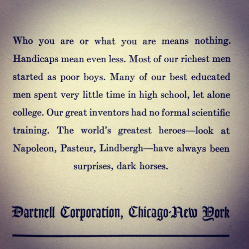
A particular article stood out for me, one that is tackled daily by me and most probably, all of you. Concerning ambition, influence and a thirst for self-improvement, twisted with philosophy and served up on a bed of enthusiasm; you've got James T. Mangans' You Can Do Anything!.


The article featured on Brain Pickings (you can view it here.) uses a section from the book (as it's almost impossible to find a physical copy and even the link I supplied is fussy about letting you view the pages if you're not in America ) titled 14 Ways to Aquite Knowledge. ' A blueprint to intellectual growth' the passage in question highlights the power of curiosity, the art of listening and observation, success and striving for it. Basically, the things we've been advised by the people who know something about anything.


Although not mentioned in this particular extract, one of the most important elements of the book focuses on 'the art of the deadline', something I feel could use a little more practice from this end.

Practice, don't be afraid to question, never stop wondering, desire, experiment, always read and listen...most of the time. 

Thursday, 10 January 2013

Varoom: Paper Tigers.

Varoom! Magazine, Issue 10, 2009.

This article (although not the most challenging of the four seperate articles I have studied this year) contains topics that I feel very strongly about, so naturally, I have a lot to say on the matter. In an attempt to condense this into something readable, I combined primary and secondary information on the topic, all the relevant opinions of my own and others, and links between my work into a slideshow.  I decided on splitting the slides to correspond with sections of the writing, relating my sources and additional texts back to the article accordingly and not stray too far off topic.
Relating the article to my own opinion as an Illustrator is an important step and brings me closer to defining myself in the long run. To tackle the on-going battle between handmade art and digital, artistic purity versus commercial pollution Peter Lyle outlines how art is about you and your passion. Defined not by ideas but by enthusiasms. Even though  advertising and commercial de-sensitisation have seemingly taken over, technology should still be seen as a tool.  Freedom of expression brings out the absolute best in design, the raw workings of a persons  mind connecting with paper is unrivalled, the stale comfort of digital manipulation needs to be realised. Of course this is reflected in my personal work, and to some extent, clientel designs. But, I'm also not ignorant to the fact that technology now plays an equal role in the Art and Design industry and in order to satisfy the eternal thirst for unseen, exciting images, skills must be adapted to different working methods. Confining yourself to one comfortable working method can sterilise the outcome and render you and inaccessible member of such a vast community. It's taken me a year or so to realise this and clamber down off my high hand-drawn horse, but accepting electronically based processes has opened many exciting opportunites already. Not only that, but of course software such as photoshop, illustrator and in-design were created to enable Designers to edit and enhance their work easily, not to destroy or digitalise the image. For now, i've managed to settle on teaching myself basic skills on the programmes suitable for editing my work, something that has relieved frustration when I've been advised to adjust an element in a flat, painfuly detailed and time-consuming drawing.
Reinforcing the text with the strong influence of Walter Benjamin uncovers mechanical reproduction for what it really is; sterile, cold and the reason behind why the bulk of Illustration struggles to hold power in this day and age. Using Basford, Pardee, Morley and Sendak as a lever into the argument shows that when completing the presentation I considered all levels of the text and highlight how wealth should never be the main focus when creating.
Towards the end of the article I tried to engage more with the actual style of writing, not just the content, and how well Lyle captures his target audience.  A similar piece of writing Where is the Content? Where is the Comment? by Lawrence Zeegan for Creative Review gave me insight into similar points of view with a slightly more aggressive slant. 
Shrigley amking his mark outside the Hayward Gallery in connection with Creative Review.

In conclusion, it has always been apparent what the truthin art means to me, I hope that by bridging the gap between my view and Lyles and analysing the piece of writing as a whole I can share something more than just the fact that I 'get a bit cross at computers sometimes'.

Wednesday, 5 December 2012

Let Loose In London.

October half-term could have been spent wallowing in self-pity as I couldn't afford to fly out to New York with the rest of the group. But instead of wasting a week, I consulted my bank account and decided I could afford to push the boat out and make it to London without bankrupting myself. I'd just like to say thankyou to Megabus for having such affordable prices alongside adequate comfort. Anyway, me and Daniel (another unfortunately broke soul) scheduled a three day trip full of educational visits to museums, exhibitions, and a whole load of other suitably touristy things. It just so happens, that an artist of huge influential power who i've talked about in previous post's and presentations, works in the centre of Soho. After speaking with the mighty Scott Move about visitng the studio, picking his brain and pestering him for advice he arranged to see both me and Dan on the last day of our visit. So now our trip ticked all the boxes; cheap, cheerful, contact with the industry, educational basis and a high chance of returning in one piece.

I hadn't realised until now that i'd taken nearing on three hundred photographs of taxidermied creatures, non-descript buildings and norwegian bikers in dark bars...amongst these gems i've filtered the more important snaps to give you a taste of our hectic three day mission into the wilderness of London town.


Admiring the architecture. Cromwell Road, London.

 
Upon arrival, we realised the down-side of catching the cheapest bus humanly possible. The drop-off point was in the middle of bleeding no-where so we were instantaneously lost. Thank god for google maps, and obviously, common sense. By the time we'd reached London Victoria it'd started to sink in that visiting the capital city during one of the most popular school breaks of the year wasn't the gretest idea in the book. After fighting our way through crowds of frustrated parents and screaming children we purchased tube tickets so we could begin our day of sightseeing...we purchased the wrong tickets. Anyway, skipping forwards an hour or so we find ourselves outside destination numero uno on the treasure trail, the Natural History Museum. However, the victory dance was short-lived as we then had to join the end of a forty minute que whilst attempting to make the most of my time spent stood outside some of London's most impressive Victorian architecture. Originally opened in 1881 the designs had been altered several times between the years of 1862 to '81 and transformed, ironically, from London's ugliest building into the distinctive structure we know today. From competition winner Captain Francis Fowkes' deliberately Renaissance blueprints into aspiring young architect, Alfred Waterhouses' German Romanesque final designs. Educating myself about this impressive building passed the time and helped to distract myself from the fact me and Dan were being stared, pointed and probably laughed at by a school of small children. They must have thought we'd escaped from the satanic cult section of the museum judging from their wide eyes as they pointed at our piercings like we had horns growing from our noses. Ten more minutes of avoiding disgruntled parents and we entered the breath-taking entrance hall surrounded by high spires and it's huge facade. Inspired by the Basalt Columns in Western Scotland the grand Entrance boasts a vast array of rounded arches, sweeping staircases and a purposeful contrast between stone, glass and bare iron.


Left to right: Laughing owl in glass case of emotion, night at the museum, skinny whales.

 
Gathered over almost four hundred years, the life and earth science collections contain over seven hundred million specimens, well over a day's entertainment. We were there approximately four hours and managed to get round the whole museum skimming over the intensely catergorised rock section and the part where 'kids get to press buttons and see stuff light up'. I took a stupid amount of photographs so have edited the most relevent images that I plan to use as primary research and first hand observation in the future.

Left to right: perfectly plaiced skeleton, mickey moose and a grumpy Fennec Fox.


A cloud of bats.
The whole day was a really momentous experience, I never realised just how exciting looking at dead animals and rock's could be but I ended up learning more in those few hourse than I had in months and came away with reams of first hand photographs to draw more accurately from.


Left to right: Pinky and the brain, 'ant you ever seen a deeno-saur and the hunter and the hunted.
Day one, complete. Day two was a slightly different matter as I pulled my usual trick of sleeping in, but thanks to some slick navigation and google maps managed to make it to the second port of call on our adventure, the Hunterian Museum. Based in the Royal College of Surgeons, this bicentenary exhibition of incredibly detailed human anatomy and pathology is tucked out of the way just off Lincoln's Inn Fields. Boasting an incredible variety of morbid curiosities, floating in jars or housed in the floor to cieling glass cases, I would strongly reccomend the Hunterian for anyone with a strong stomach and curious personality.

Hunterian Gallery, taken from;
http://odditiesoflondon.blogspot.co.uk/2011/06/hunterian-museum-royal-college-of.html
The self-taught, 18th Century Surgeon, John Hunter is the man responsible for the preservation of all these unusual artifacts. It has been rumoured that he hired a whole host of 'body-snatchers' to illegally excavate cadavers for practice in developing skills and discovering new-fangled procedures.

A selection of categorised animal fetuses.
A selection of, um, brains.
Everything from sections of whale skull, antlers, dissected insects, human brain matter, diseased organs, a 'giant's' skeleton, a surinam toad caught mid-birthing process and preserved to insanely detailed paintings and perfectly correct models, can be found in this magnificent gallery. No photography was permitted inside the buildings so the photographs above were found on the blogspot given or the Royal College of Surgeons website stated previously. The hour we spent looming over sections of rotten lung and severed feet was one of my personal highlights of the whole trip, which sounds scarily morbid but honestly, you don't get the chance to come nose to nose with a two hundred year old brain every day.

Late into our second day we did the usual touristical escapde with camera's at the ready, surfing the tube and seeing some of London's most sought after Landmarks...including a couple of Camden's most luxuriously creative taverns such as Our Black Heart, notorious for housing some of London's most sought after musical advertisements and artwork, Brew Dog with it's cleaner, more up-market approach to brewery come watering hole and lastly, onto Crobar in the heart of Soho.


Moving swiftly over the part where I 'accidentally' (not drunkenly, i hasten to add..) got on the wrong tube and almost had to spend the night begging in Camden town, i'll start on the most important part of journey. Our third and final day, meeting Scott Move at The Circle tattoo studio in Soho.

I'll continue my experience and advice sourced from Scott in a new blog post to highlight 'Contact With Industry' seperately.

Tuesday, 13 November 2012

Barbato Envy.

Whilst planning my educational and adventurous trip to London I stumbled across a few new monumental artists, of which, Italian freelance Illustrator Vania Barbato stood out like a beacon to me.

 
Unfortuantely, I do not have a great deal of information on this artist or her working methods as her blog is written in Italian and my languages are a little rusty. From what i could decipher she was born in Padova, currently resides in Bologna after studying Illustration and some form of comic book art, possibly comics/graphic novels? She sees herself as a medium, a teacher and even a vissionary.
 
 
Of course the fine detail and curiously morbid centerfold caught my eye from a single glance, but after studying several images included in Barbato's selective portfolio, I found myself mesmerised by the haunting expressions on her characters faces.


The majority of her work can be viewed on her blog here, where the above images are sourced from, and a ludicrously short interview with Vania, here.


Thursday, 6 September 2012

Book Worm

Starting to lag even with the finish line in sight because i can't seem to get my head out of a book or online article! So many new artists, processes and cultures to study! For bed time reading i've been obsessing over Murakami's 'The Wind Up Bird Chronicles', bus/train journeys have been accompanied by Darian Leader's enthralling read Stealing the Mona Lisa which focuses on what visual art hides and the psychology of viewing it.

Sunday, 19 August 2012

A New Muse...

So over summer i've managed to build myself a nice little collection of books by a wonderful man named Jeffrey Brown. This is my most current amusement... 'Cat Getting Out Of A Bag'. He's the perfect accompaniment to our summer project for quick sketches of play by play scenes, since a lot of his work consists of very quick and comic-like drawings.

You can check out his work here. Other books i'd reccomend would include 'I Am Going To Be Small' (ironic for me really...) and 'Unlikely'.

Whilst browsing for more Jeff Browns on the messy shelves of Travelling Man I found a book called 'I Never Liked You' by a chap called Chester Brown, which lends the same style to tell much darker stories in a very bleak, minimilistic way. If you happen to like Jeffrey Brown, check out Chester Brown, although 'I Never Liked You' isn't for those easily upset.